Hey everyone! Today, I'm so pleased to host Savannah Cordova. She's writes a very interesting piece. Welcome to my blog, Savannah...Over to you. :)
.
.
A book cover is one of the most crucial elements when it comes to attracting readers. Most of us have heard the saying “you can’t judge a book by its cover”, but the truth is that a beautiful cover illustration — or one that signifies a specific genre — is often the first thing we consider to gauge our interest. If you’re wondering how to make your book stand out above the rest, then consider these three eye-catching trends to really make your cover pop!
1. Yellow with contrasting colors
Prior to 2018 or so, yellow was rarely used on book covers. (Seriously, try to think of a pre-2010s book with a yellow cover.) The good news for authors is that using this previously underutilized color can definitely make your book stand out on shelves and demonstrate its trendiness! Opt for yellow and gray if you want extra style points, as these were named the Pantone colors of the year for 2021.
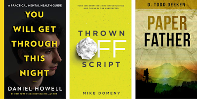
Recent books that have taken advantage of chartreuse-yellow covers — as opposed to the mustard yellow of yore — include You Will Get Through This Night by Daniel Howell, Thrown Off Script by Mike Domeny, and Paper Father by D. Todd Deeken. You may notice that these examples all hail from very different genres, from mental health guidance to dystopian fiction, which proves just how versatile this trend is! Whichever genre you choose to write in, you can bet that your book will shine with a striking yellow-green cover.
2. Big and bold patterns
For a while, minimalist book covers were all the rage — Rupi Kaur’s Milk and Honey is a quintessential example of this — but with the 2020s has come a new and loud trend. The bright colors and interesting shapes across the front and back covers of these books act almost as active voices that demand your attention.
Books hot off the press, like The Vanishing Half by Brit Bennett and Women Don’t Owe You Pretty by Florence Given, are cleverly using bold patterns to catch readers’ eyes right away. Of course, whether or not you should choose a bold pattern depends on your book’s theme; for example, you may want to steer clear if you’ve written a book about tragedy. But if you’re writing a story with lots of action (or similar bold themes), this trend is definitely worth a try.
3. Imagery within the title
Replacing letters with objects of a similar shape can lend an element of intrigue to your cover and connect the title with the book’s imagery. Some authors opt for designs that replace letters with recognizable objects; a great example of this is Serpent & Dove by Shelby Mahurin, where the golden snake in the title doubles as an ampersand.
You can also add flavor to your cover by replacing letters with abstract objects — as on the cover of Breath by James Nestor, which uses in-title particle effects to reflect the book’s scientific theme. If you need help with ideas for this, try attending an online art workshop to develop your artistic understanding! The end result is worth it: in-title images draw the reader's eyes straight to the title, while also giving them insight into your book’s themes.
In the end, it could be that none of these trends are for you – or maybe you want to combine them all! Either way, if you have fun with it, it’s sure to engage the reader too. Go on and make the world a little bit brighter with your exciting new cover design!
Savannah Cordova is a writer with Reedsy, a marketplace that connects self-publishing authors with the world's best editors, designers, and marketers. In her spare time, Savannah enjoys reading novellas, writing short stories, and browsing the bookstore for interesting book covers. She's no artist herself, but she remains deeply fascinated by contemporary design!


Very interesting post. Much as we would like to think otherwise, we do judge a book by its cover. Personally, I like big and bold patterns, option #2 in Savannah's list.
ReplyDeleteYes, the book cover makes a difference. Thank you for reading. :)
DeleteBook covers always have played an important part in getting the reader and the buyers attracted at the very first look, and I remember as a young reader ata very early age, a nicely illustrated and designed book cover in hard cover or paperback have always kept me excited and eager to read the book and enjoy it :) Great post.
ReplyDelete